
How Pantone Colors Influence Cosmetic Packaging and Bottle Designs
Pantone shapes the world of cosmetic packaging. When you pick up a beauty product, you notice the color first. That color needs to be spot-on every time. Why? Take a look:
- Color accuracy makes you trust a brand more.
- Consistent shades keep you loyal and happy.
- Each color can spark a different feeling, which can make you want to buy.
Pantone’s universal language helps brands like Xinfly Packaging stand out and connect with you. Think about what the right color can do for your own products.
Key Takeaways
- Getting colors right helps people trust your brand. When colors stay the same, customers feel sure about your products.
- Colors can change how people feel. Pick colors that make customers feel the way you want.
- Pantone helps keep colors the same. The Pantone Matching System makes sure your colors match on all packages.
- Bright and bold colors help your products stand out. These colors catch people’s eyes and get your products noticed fast.
- Choose colors that show what your brand believes in. This helps customers feel closer to your brand.
- Always check your packaging in different lights. This makes sure your colors look right everywhere.
- Keep up with new color trends. Use Pantone’s Color of the Year to make your packaging look new and interesting.
- Work with your suppliers closely. Share Pantone codes and design files to stop color mistakes and keep quality high.
Pantone and Cosmetic Packaging
Color’s Role in Packaging
When you go into a store, you see the color first. The color catches your eye before you read anything. Brands use colors to help their products stand out. Studies show you pick what to buy very quickly. Most of your choice comes from how you feel about the color.
Did you know? Color makes up most of your first impression of a product.
Here are some important facts about how colors affect cosmetic packaging:
| Key Insights | Description |
|---|---|
| Attention Draw | Colors are what people notice first. |
| Brand Choice | Fewer color choices can change which brand you pick. |
| Nonverbal Significance | Colors give silent clues in marketing. |
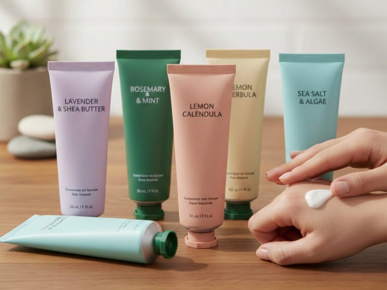
Skincare packaging often uses soft pastels. These colors help you feel calm. Bright reds and golds show luxury and excitement. These colors work well for fancy products. Neutral colors like beige or gray look classy. Expensive brands use these colors to show they are high quality.
- Colors can make you feel fancy, pure, excited, or relaxed.
- Soft pastels are used in skincare to make you feel calm.
- Bright colors like red and gold show wealth, good for fancy products.
- Neutral colors look classy and attract people who want high-end brands.
When you pick colors for your brand, you want them to match your message. The right color helps your product stand out on busy shelves.
| Key Findings | Description |
|---|---|
| Decision Time | People choose products fast, often in 90 seconds, because of color. |
| Color Perception | Most people’s opinions come from color. |
| Role of Colors | Colors are very important in marketing to get people interested. |
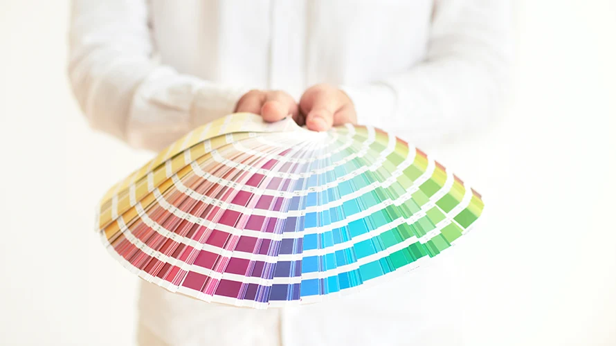
Pantone’s Universal Language
Pantone helps people talk about colors without getting mixed up. If you want your packaging to look the same every time, you need a system everyone knows. Pantone’s color language makes this easy. You pick a Pantone color, and your manufacturer knows exactly what you mean.
Here’s why Pantone is important for cosmetic packaging:
| Benefit | Description |
|---|---|
| Color Precision | Makes sure colors look right, making boxes look better. |
| Brand Identity | Shows luxury and helps people know your brand. |
| Consumer Engagement | Makes your brand easy to see and helps people stay loyal. |
| Cohesive Design | Keeps colors the same on all materials for a matching look. |
| Competitive Edge | Helps brands stand out and look high quality. |
Pantone uses a special system called PMS. PMS has inks with special codes. You use these codes to make sure your packaging always looks the same. Designers and printers use Pantone swatch books to check colors. This helps your brand look the same on bottles, boxes, and labels.
- Pantone uses a color matching system called Pantone Matching System (PMS).
- PMS uses inks with special codes so colors always look the same.
- Designers and printers use swatch books to see the final color and keep packaging colors correct.
If you want your packaging to send the right message every time, Pantone helps you do that. You get colors that match your brand, stay the same, and make your products easy to spot.
Pantone Matching System
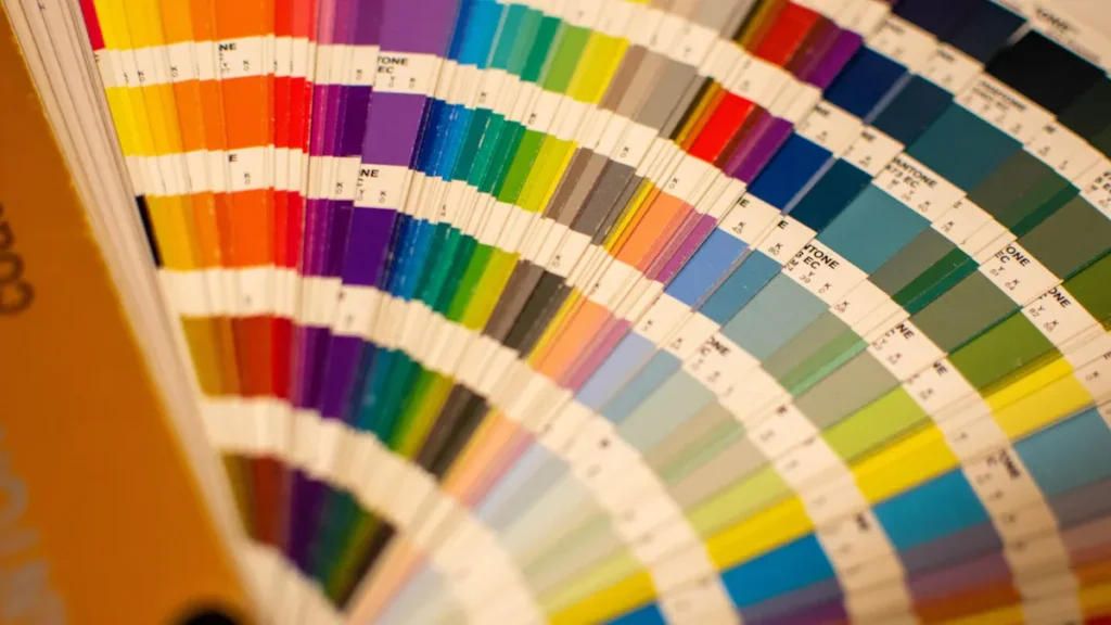
What Is PMS?
You may wonder why the pantone matching system is important in cosmetics. The pantone matching system, or PMS, helps you get the exact color you want. It has a huge library with more than 1,000 colors. Each color has a special code. You can tell your designer or manufacturer the code you need. This way, you do not have to guess if the color will be right.
- The pantone matching system gives everyone a shared color language.
- You can use it to match your lipstick box and lotion bottle.
- Brands use the pantone matching system to keep their look the same everywhere.
Using the pantone matching system makes your brand look professional. It also helps your team talk about colors without getting confused.
Color Accuracy in Production
Across Materials
Getting the same color on different materials is hard. The pantone matching system helps you fix this problem. You might use plastic for bottles, paper for boxes, and metal for caps. Each material takes in color in its own way. The pantone matching system lets you match your color on all these surfaces.
- Custom color matching makes sure your brand color looks the same everywhere.
- The pantone matching system helps you avoid color problems between materials.
- You can keep your brand identity strong, no matter what packaging you use.
Avoiding Shifts
Colors can change during production. Sometimes, raw materials are different in each batch. Factory lights can also make colors look different. The pantone matching system helps you find these problems early. You can use swatches and samples to check if the color matches your standard.
Tip: Always look at your packaging in different lights to make sure the color is correct.
Manufacturers deal with things like pigment changes and customers wanting perfect color. The pantone matching system gives you ways to handle these problems and keep your packaging looking good.
Pantone vs. CMYK
You may hear about CMYK when talking about printing. CMYK stands for cyan, magenta, yellow, and black. It mixes these four inks to make colors. The pantone matching system uses pre-mixed inks for each color. This means you get the same color every time, which is very important for your brand.
| Limitation | Description |
|---|---|
| Color Inconsistency | CMYK can change from printer to printer, making your brand look different. |
| Vibrancy Challenges | CMYK struggles with bright or metallic colors, while the pantone matching system handles them well. |
| Material Dependency | CMYK colors can look different on paper, plastic, or metal. |
When you use the pantone matching system, your products look the same everywhere. CMYK works for some jobs, but it cannot promise the same color accuracy. The pantone matching system is the best choice for strong, reliable branding in cosmetics.
Brand Identity
Signature Colors
When you think about your favorite cosmetic brand, you probably picture its signature colors right away. These colors do more than just look pretty. They help you spot your favorite products on a crowded shelf. Pantone makes it easy for you to pick a color that matches your brand’s personality and keeps it consistent everywhere.
- White shows tranquility and calmness.
- Green reminds you of nature and freshness.
- Purple gives a sense of royalty and luxury.
- Maroon suggests beauty and creativity.
Using signature colors can boost your brand recognition by up to 80%. These shades act like a shortcut for your eyes and mind. You see the color, and you know the brand. When you use the same colors on every product and in every ad, you make your brand stronger and easier to remember.
Xinfly Packaging uses pantone colors to help brands stand out. For example, they work with brands to choose a unique color and then use it on bottles, boxes, and labels. This way, your brand always looks the same, no matter where customers find it.
Other brands do this too. Nimi uses pantone color printing on their boxes to look both fancy and practical. Newave.eco picks pantone colors for their packaging to show they care about the planet.
Emotional Impact
Colors do more than catch your eye. They make you feel something. When you see a certain color, it can change your mood or even make you want to buy a product. Pantone helps you pick the right colors to match the feelings you want your brand to share.
| Source | Key Insight |
|---|---|
| Will ‘Future Dusk’ be the color of 2025? Pantone and colors in the cosmetics industry. | Colors shape how you see, feel, and remember a brand. |
| Label Design: The Emotions of Colors | Your culture and background can change how you react to colors. |
| How Your Packaging’s Visuals Impact Consumers | Brands use color and design to create feelings based on what people like. |
| How Color Theory Should Influence Your Packaging Design | Colors can make you feel happy, calm, or excited, and this can help you connect with a brand. |
When you use pantone colors, you can create a special feeling for your brand. Maybe you want your brand to feel peaceful, bold, or creative. The right color choice can make that happen.
Aligning with Values
Your brand is more than just a logo or a product. It stands for something. When you pick pantone colors that match your brand’s values, you help people understand what you care about. Color works best when it truly shows what your brand stands for. This makes your connection with customers stronger.
Research shows that color can affect up to 85% of buying choices. That means your color choice is a big deal. If your brand stands for nature, you might pick green. If you want to show luxury, you might choose purple or gold. Pantone helps you find the perfect match.
- The Pantone Colour Institute gives advice to brands about color strategy.
- They know that the right color can help people feel closer to your brand.
When you use pantone colors that fit your brand’s values, you build trust and loyalty. Your customers see your products and know what you stand for.
Consistency in Packaging
Challenges
You want your cosmetic packaging to always look the same. This can be hard to do. Many brands have trouble keeping their colors the same. Sometimes, the color on your computer is not the same as on your bottle. Other times, the color you pick does not fit your brand. In some countries, a color might mean something different. If you use too many colors, your packaging can look messy. If the words do not stand out, people cannot read the label. If you change colors a lot, customers might get confused.
Here’s a table that shows some common problems you might face:
| Challenge Type | Description |
|---|---|
| Mismatched Brand Messages | Picking the wrong color can confuse your customers. |
| Cultural Misunderstandings | Colors can mean different things in other places. |
| Visual Clutter | Too many colors make packaging look busy. |
| Poor Contrast | Labels are hard to read if colors do not stand out. |
| Inconsistent Production | Colors can change from your design to real packaging. |
| Trend Chasing | Changing colors too much can hurt your brand’s trust. |
| Longevity of Color Choices | Using the same colors helps people remember your brand. |
Multi-Material Solutions
You might use bottles, caps, and labels made from different stuff. Each one takes color in its own way. This makes it hard to keep your packaging looking the same. The pantone system helps you fix this problem. It lets you match colors on all your packaging parts.
Bottles, Caps, Labels
Here are some tips to help you get the same color everywhere:
- Use the Pantone Matching System (PMS) to get the right color on every material.
- Know the difference between Pantone C (coated) and Pantone U (uncoated) so you pick the best color for each part.
- Always use the newest Pantone color book. This helps you avoid old or faded samples.
- Ask for a press proof or a Pantone color chip before you start making a lot.
- If you print on kraft or dark materials, you may need extra white ink to make the color show up. This can cost more, but it helps your packaging look good.
- Sometimes, you can use CMYK printing for more color choices, but use one or two Pantone colors for the most important parts.
Tip: Always check your packaging samples in different lights to make sure the color looks right.
Quality Control
You want every package to match your chosen color. Quality control helps you do this. You can use the Pantone Color Matching System to check every batch. Some companies use special machines, like BOBST’s oneECG, to match colors with computers. This makes your packaging more stable and reliable.
Here’s how you can keep your packaging colors perfect:
- Use the Pantone system to check color accuracy at every step.
- Try new technology, like digital color matching, for better results.
- Test your packaging with real Pantone color chips or press proofs.
- Only approve packaging that matches your color standard.
When you do these things, your packaging will always look neat and professional. Customers will see you care about details and trust your brand more.
Visual Appeal and Trends
Color Psychology
You probably notice how some products just pop off the shelf. That’s not an accident. Brands use color psychology to shape how you feel about their products. When you see soft pastels, you might feel calm or safe. Bright shades like orange or yellow can make you feel excited or happy. These choices help brands connect with you on an emotional level.
Pantone colors play a big role in this. When you see a certain shade, your brain links it to a feeling or a memory. For example, a gentle pink can make you think of comfort, while a bold red can spark energy. Brands use these effects to boost the visual impact of their packaging. You start to trust and remember products that match your mood or style.
Tip: Next time you shop, notice which colors grab your attention first. That’s color psychology at work!
Pantone Trends
Pantone sets the tone for what’s hot in the world of cosmetics. Each year, they pick a Color of the Year that inspires new packaging and product launches. When brands use these trending shades, they show you they’re up-to-date and stylish. This helps them stand out and gives their products a fresh look.
Seasonal Colors
Cosmetic brands love to use seasonal Pantone colors for special editions. In spring, you might see soft nudes or gentle pinks. Summer brings out vibrant oranges and bold yellows. These shades make products feel new and exciting. For example, brands often use colors like Fiery Red or Bright Yellow for limited edition packaging. These choices create a sense of exclusivity and excitement, making you want to grab them before they’re gone.
Here’s a quick look at some trending Pantone colors in cosmetic packaging for this year:
| Color Name | Description |
|---|---|
| Peach Fuzz | Pantone’s Color of the Year 2024, a soft orange-pink that feels warm and inviting. |
| Vibrant Oranges | Energetic shades that catch your eye and add a playful touch. |
| Pastel Nudes | Minimalist tones that give a clean, simple look and highlight transparency. |
Custom Blends
Sometimes, brands want something unique. They work with Pantone to create custom blends that match their brand’s personality. These special mixes help products stand out and boost their visual impact. Custom colors can also match a brand’s values, like using earthy tones for eco-friendly lines or metallics for luxury collections.
You’ll see these custom blends in limited edition sets or collaborations. They make the packaging feel special and collectible. When you spot a product with a one-of-a-kind shade, you know the brand put extra thought into its aesthetics.
- Pantone’s Color of the Year often leads to a rush of new products in that shade.
- Trending colors reflect what’s happening in the world, like a move toward natural tones or a burst of bold shades after big events.
- Brands that follow these trends show they care about style and creativity.
Pantone colors help brands create packaging that feels fresh, stylish, and full of personality. You get drawn in by the aesthetics, and the visual impact makes you remember the product long after you leave the store.
Market Differentiation
Shelf Impact
When you walk into a store, you see many cosmetic products. The colors catch your eye first. Brands use pantone colors to make their packaging stand out. Bright shades and strong designs grab your attention before you read anything. This is done on purpose. Brands pick colors that help you remember them.
Here’s how pantone colors help brands get noticed:
- Brands pick bold color palettes that are easy to see. These colors help you spot products fast.
- Some brands use special colors, like jewel tones, instead of soft pastels.
- Brands use color psychology to make you feel certain ways. Soft pastels feel gentle, and rich colors feel fancy.
- Strong contrast between colors makes products look exciting and grabs your attention.
- Brands keep their colors the same on all products. This helps you find your favorite brand quickly.
When you see a brand with strong colors, you feel sure about your choice. Pantone colors help brands make packaging that stands out.
Segmentation
Not every shopper wants the same thing. Brands use pantone colors to reach different groups. You might see bright colors for teens. Soft shades are used for skincare. Metallic colors are for luxury products. This helps brands connect with you and makes marketing work better.
Here’s how pantone color segmentation helps in cosmetic packaging:
| Evidence Point | Description |
|---|---|
| Precise Color Representation | Pantone gives brands exact color matching, making boxes look sharp. |
| Cohesive Packaging | Using the same pantone colors makes packaging fit each group. |
| Brand Visibility | Pantone colors make brands easier to see and help marketing reach more people. |
| Unique Brand Identity | Custom pantone designs show luxury and make brands special. |
| Competitive Advantage | Pantone colors help brands stand out and attract buyers. |
When brands use pantone colors for different groups, you get packaging that feels special. This makes you want to pick up the product and trust the brand.
Success Stories
You can see how pantone colors help real brands. Xinfly Packaging works with brands to make packaging that stands out. They help brands pick colors that match their story and goals. You see their work on bottles, boxes, and labels that always look the same. This builds trust and keeps you coming back.
Other top brands use pantone colors to make their marketing better. Some brands make limited editions with custom colors. These products become collector’s items and get lots of attention. Brands use pantone colors to show their values, like green for eco-friendly or gold for luxury.
When you see a brand with strong color choices, you know they care about quality and marketing. Pantone helps brands make packaging that is easy to spot, easy to remember, and perfect for their audience.
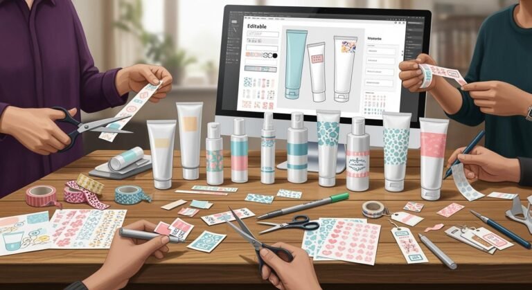
Implementation Steps
Choosing Pantone Colors
Picking Pantone colors for packaging is fun. You want your box to show your brand’s style. The color should make a good first impression. Here’s how you can start:
- Pick Pantone colors that fit your brand and mood.
- Make samples of your packaging. Test them to see if the colors look right.
- Start making lots of boxes only when you like the color.
You might use glass, plastic, or metal for packaging. Each material can change how the color looks. For glass, test samples to check color accuracy. For plastic, think about how light and heat can change the color. For metal, choose the right finish and make sure the color stays.
Tip: Always look at your samples in different lights. This helps you see if the color looks good and keeps your packaging looking nice.
Working with Suppliers
You need to talk with your suppliers to get the best packaging. Good teamwork helps your box designs and colors stand out.
Communicating Specs
Share your Pantone color codes and design files with your supplier. Make sure your files use CMYK mode, but always add the Pantone code for the exact color. This helps stop mistakes and keeps your colors the same.
| Aspect | Description |
|---|---|
| Brand | Mielle Organics |
| Collaboration Purpose | Used Pantone colors for their 10th anniversary packaging. |
| Pantone Services Utilized | Used Pantone products and services for color consistency across all packaging materials. |
| Technology Used | Used advanced X-Rite technology for color matching. |
| Additional Services | Got custom color standards and trend advice from Pantone. |
Prototyping
Ask your supplier to make a sample package. Check the sample for color and looks. If you see problems, ask for changes before making lots of boxes. This step helps you fix issues early and keeps your packaging looking great.
Note: Prototyping lets you see your packaging colors in real life and helps you find problems early.
Production Management
Managing production means keeping your packaging colors perfect. Here are some easy tips:
- Make sure your design files use CMYK mode, but always pick a Pantone color for special shades.
- Give your supplier both the design files and Pantone codes. Only using CMYK can cause color mistakes.
- Use the Pantone Color System to get colors that CMYK printing can’t make. This helps your brand look the same and keeps your packaging pretty.
“To get the colors you want, make sure your design files are in CMYK mode. If you want a special color, pick a Pantone color. Using only CMYK codes may not give you the right color.”
When you follow these steps, your customers will have a better experience. Your packaging will always look new, and your box designs will stay nice. You will find it easier to keep your packaging colors and brand style strong.
Future of Pantone in Packaging
Digital Printing
You see more brands using digital printing for cosmetic packaging every year. This technology changes how you work with Pantone colors. Digital printers use smart software to get very close to Pantone shades. Sometimes, you cannot use pure spot colors, but you still get great results.
Digital printing gives you better color accuracy and consistency. You want your lipstick box and lotion bottle to match every time. Digital printing helps you do that. You can print small batches and test new designs without wasting money. This makes it easy to try new colors or update your look for a season.
Designers love digital printing because it lets them pick Pantone colors and see them on real packaging fast. You can make your packaging look sharp and professional. Your brand stands out on the shelf, and customers remember you.
Tip: If you want to test a new Pantone color, ask your supplier for a digital print sample first. This helps you see the real color before you order a big batch.
Sustainability
You care about the planet, and so do your customers. The future of Pantone in packaging ties closely to eco-friendly choices. Many brands now use recycled materials and water-based inks. Pantone colors work well with these new materials. You can keep your brand colors strong and still help the environment.
Here are some ways Pantone supports green packaging:
- Pantone offers guides for eco-friendly inks.
- You can match colors on recycled paper, glass, or plastic.
- Brands use Pantone to show their green values with earthy tones and natural shades.
Choosing Pantone colors for sustainable packaging shows you care about both style and the planet. Your customers notice this and trust your brand more.
Evolving Branding
Branding never stands still. You want your products to feel fresh and modern. Pantone helps you do this. Each year, Pantone picks a Color of the Year. Many brands use this color to update their packaging and connect with trends.
You can use Pantone colors to tell your brand story. Maybe you want to show luxury, fun, or calm. Pantone gives you the tools to do that. You can also create custom blends that fit your brand’s personality.
| Branding Goal | Pantone Solution |
|---|---|
| Stay on trend | Use Color of the Year |
| Show values | Pick colors that match them |
| Stand out | Create custom blends |
Your brand grows and changes. Pantone helps you keep up. You can refresh your look, try new ideas, and always keep your packaging consistent. This keeps your customers excited and loyal.
Note: The right Pantone color can make your brand feel new, even if your product stays the same.
Pantone colors help you create packaging that stands out and stays true to your brand. You get accuracy, consistency, and a look that customers remember. Xinfly Packaging shows how smart color choices can boost your products. Want to start? Try these steps:
- Pick Pantone colors that match your brand story.
- Test samples before full production.
- Work closely with your supplier.
Pantone Colors & Cosmetic Packaging – Frequently Asked Questions
Lock brand color across tubes and bottles: Pantone matching, ΔE tolerances, substrate shift, varnishes/foils, sustainability, regulatory legibility and supply-chain tips.
1) Why use Pantone for cosmetic tubes and bottles?
2) What’s a realistic color tolerance for packaging?
3) Why can the same Pantone look different on tubes vs. bottles?
4) How do I proof color accurately?
5) Are Pantone inks the same as molded masterbatch colors?
6) Do varnishes and coatings change the perceived color?
7) How do metallic foils and metallization affect brand colors?
8) What’s the best workflow for color approvals?
9) How do I manage color across multiple suppliers?
10) Any tips for legibility and compliance?
11) Will dark colors hurt recyclability?
12) How do seasonal or “Pantone Color of the Year” launches stay consistent?
13) What testing prevents color rub-off or staining?
14) Can PCR or bio-PE alter color outcomes?
15) Why choose Xinfly Packaging for color-critical projects?
Ready to customize your packaging? Contact our team for detailed pricing, MOQ flexibility, and fast production samples.