
The Impact of Pantone Colors on Cosmetic Tube Design
You notice Pantone colors when you look at cosmetic packaging. Color affects how you feel about a product first. It helps brands get noticed by people. Research shows color can change most of your buying choices.
- Color helps you know a product better than other things you see.
- It gives a product its look and makes you want to look at it.
Pantone keeps colors the same, so brands can match their values like caring for the planet. Trends and the Pantone Matching System help brands pick colors that matter to you.
Key Takeaways
- Pantone colors help brands stand out and look nice. They make products easy to spot and remember. Using the Pantone Matching System keeps colors the same on all packages. This helps customers trust the brand more. Colors can change how people feel and what they buy. About 85% of shoppers say color matters when they shop. Picking the right Pantone colors helps brands share their story. It also helps them connect with people better. Following color trends, like the Pantone Color of the Year, keeps brands new and interesting.
Pantone Colors in Cosmetics
Brand Identity
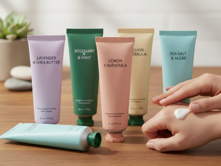
Brands need to stand out in a busy market. Pantone colors help you spot your favorite brands fast. These colors give each product a special look. The look matches the brand’s style. When you pick up a tube, you see the color first. The color shows if the brand is fun, honest, creative, or fancy.
Tip: Brands use Pantone colors to show what they care about, like being green or looking fancy. You can tell what matters to them by the packaging.
Here is how Pantone colors help brands look strong:
| Aspect | Explanation |
|---|---|
| Herding Suppliers | Pantone gives brands one goal, so every supplier matches the same color, no matter how they do it. |
| Consistency Over Time | Pantone rules keep colors the same for all products and reprints, so the brand always looks right. |
- Colors make you feel things and show what a brand means.
- You like brands that use colors to tell their story.
- Pantone colors make packages look neat and nice.
Visual Appeal
Pantone colors make tubes look bright and cool. You see bold colors that grab your attention. These colors help products pop out and make you want to try them. When brands use Pantone, every tube looks the same.
- Pantone colors keep the brand’s look the same.
- They make products look better and catch your eye.
- Using Pantone Colors of the Year helps brands stay trendy.
You judge products by their color. Studies say color makes up most of your first thoughts. Most shoppers look at the package before buying. Many people say color is why they pick a product.
Some popular Pantone colors in tube design are:
- Artisan’s Gold: This color shows quality and makes you think it is special.
- PANTONE 17-1230 Mocha Mousse: This warm brown, picked as Color of the Year for 2025, makes you feel cozy and fancy.
Pantone colors help brands make packages that look great and feel special. You can see the difference when a tube uses Pantone colors.
Color Consistency in Cosmetic Packaging
It is hard to keep colors the same on every package. You want each tube, bottle, or jar to match. It should look the same no matter where it is made. When colors stay the same, you know the brand cares. You trust the brand more when you see the same color each time.
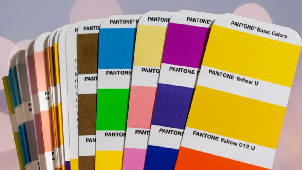
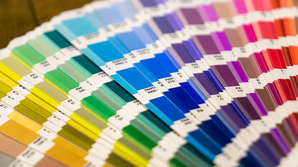
Pantone Matching System
The Pantone Matching System helps keep colors the same. It gives everyone a way to talk about color. Designers and makers use it to match the brand’s look.
| Aspect | Description |
|---|---|
| Standardization | The Pantone Matching System uses one way to copy colors. |
| Communication | It helps people share color needs without mistakes. |
| Consistency | It keeps colors the same in different places and on materials. |
Pantone Matching System makes colors very accurate. Your brand looks strong and logos always look right. The Pantone Chip Standard is a guide for color. It helps keep the color the same from start to finish. This system stops mistakes before products go to stores.
Note: Using the Pantone Matching System helps everyone talk about color. It stops mix-ups and saves time.
Using Pantone Matching System helps your brand for a long time. You get the same color every time, so customers do not get confused. It helps you move from computer designs to printed packages. Your images stay clear and true.
Material Uniformity
Material uniformity is important for keeping colors the same. Different materials can change how a color looks. A color on plastic may look different than on metal or paper. Light bounces off each surface in its own way.
- Material uniformity helps keep Pantone colors the same on all packages.
- Different materials, finishes, and types can change how colors look.
- A good color management plan helps control these changes.
You start by picking a Pantone color sample. Makers use special ink, masterbatch, or digital formulas to copy the color. They must think about the material, finish, and type of container. These things change how the color looks in different lights.
Here is a simple way to match colors:
- Start with a Pantone color sample.
- Use the right ink or masterbatch to match the color.
- Change things for the material and finish to get the best look.
Tip: Always check your package in different lights. This helps you find color changes before selling.
Cosmetic brands have problems keeping colors the same:
- Raw materials can change color between batches.
- Lights can make colors look different, causing mistakes.
- Using different pigments can make colors vary.
A strong color management plan helps fix these problems. The Pantone color system gives you set shades. You can keep your brand looking the same on all packages. Companies like Xinfly Packaging use these systems to give good results to their clients.
Consumer Perception
Color Psychology
You notice how color shapes your first impression of a cosmetic product. Pantone colors help beauty brands create strong feelings and set the mood for their products. When you see blue on a tube, you may feel calm or trust the brand. Achromatic colors, like black or white, look neutral and can make you think of warnings or risks. Colorful packaging grabs your attention, but if a product has no color, you might think it looks less real.
| Color Type | Emotional Impact | Consumer Perception |
|---|---|---|
| Blue | Calmness, trust, positive emotions | Intelligence, responsibility |
| Achromatic Colors | Neutral, unemotional | Risk, warning |
| Colorful Packaging | Visual attention | Less realistic without color |
Pantone colors guide you to feel certain emotions. You connect with brands that use color to match your mood or needs. When you see a new shade, you may want to try it because it feels fresh or trendy.
Sentiment and Behavior
Color does more than look nice. It changes how you act and feel about beauty products. You often choose a cosmetic brand because the color speaks to you. In fact:
- 85% of customers say color is the main reason they pick one brand over another.
- Colors create emotions and help you connect with brands, which can lead you to buy.
“Color creates emotion, and that emotion is the building block of brand connection.”
When beauty brands use Pantone colors, they set trends and shape what you want. The Pantone Color of the Year can inspire new products and change what you see in stores. You trust brands that use color well, and you feel more loyal to them. The impact of color on your choices shows how important it is for every cosmetic package.
Pantone Colors in Design
Shade Selection
When you pick shades for cosmetic boxes, you change how people see your products. Pantone colors help you find the best shade for your brand. You think about culture, being green, and how colors make people feel. These things help you choose colors and connect with buyers in many places.
| Factor | Description |
|---|---|
| Cultural Adaptability | Brands can change color plans for different cultures and what people like. |
| Sustainability | Picking eco-friendly Pantone colors and materials makes your brand look good. |
| Color Psychology | Colors make people feel things that affect what they buy; blues and greens feel calm, reds and pinks feel exciting. |
You might use blue and green for skin care because they feel safe. Red and pink are good for makeup because they feel bold. Some brands, like Nike, use red and yellow in China to match local tastes. You also think about green choices, like soy ink and recycled stuff, when making cosmetic boxes.
Tip: Always think about what buyers like in each place. This helps your packaging get noticed.
Accents and Graphics
Accents and graphics make your cosmetic boxes stand out. You use Pantone colors to show off logos, patterns, and cool features. These accents help your boxes get attention and share your brand’s story. You can add shiny touches or strong lines to make your boxes look fancy or new.
- Accents show your brand’s style.
- Graphics help buyers remember your products.
- Pantone keeps every detail clear and sharp.
Xinfly Packaging uses Pantone colors for strong accents and graphics. Their study shows buyers see these details and feel closer to the brand.
Finishes and Textures
Finishes and textures change how people feel about your boxes. You can pick glossy, matte, or soft finishes for your cosmetic boxes. Good finishes make your boxes look special and expensive. When you use Pantone colors with the right texture, you give buyers a cool feeling.
- The materials and finishes show what your brand is about.
- Special packaging makes your boxes feel different.
- Good finishes make your products look fancy and worth more.
Pantone colors like Mocha Mousse help you make packaging that looks nice and easy to use. You give people beauty products that feel good and look great. When you pick the best finish, you help buyers trust your brand and enjoy your products.
Case Study
You can see how Xinfly Packaging uses Pantone colors to help cosmetic brands stand out. Their process makes sure every tube looks perfect and matches the brand’s story. Here is how they do it:
- Xinfly Packaging works with you to select Pantone colors that fit your brand’s message. You get to choose shades that show what your products stand for.
- The team tests samples of the packaging. You check each sample to make sure the color is accurate and matches your vision.
- Xinfly Packaging collaborates with suppliers. You benefit from this teamwork because it keeps the quality high and the color consistent on every tube.
When you use this process, you get cosmetic tubes that look bright and professional. Customers notice the strong colors and feel more trust in your brand. Many buyers say they like how the tubes look and feel. They often mention that the color helps them find your products quickly on the shelf.
You also see fewer mistakes in color from one batch to the next. This saves you time and money. Xinfly Packaging’s focus on Pantone colors means your brand always looks its best. You can build a stronger connection with your customers because they remember your products by their color.
Note: Xinfly Packaging’s method helps you keep your brand’s look fresh and reliable. You can use color to tell your story and attract more buyers.
Color Trends
Pantone Color of the Year
Every year, new colors become popular in cosmetics. The Pantone Color of the Year changes what you see in stores. In 2025, Mocha Mousse is the top color. This warm brown makes you feel cozy and stylish. Brands use it for foundations, lipsticks, and tubes. Mocha Mousse looks good on many skin tones. You find it in lots of products. The color makes packages look fancy and classic.
Here is how the Color of the Year affects tube design:
| Influence Type | Description |
|---|---|
| Versatility | Mocha Mousse fits many skin tones and product types. |
| Sophisticated Appeal | The color gives packaging a fancy and timeless look. |
| Alignment with Sustainability | Its earthy shade links you to nature and green choices. |
You also see other Pantone colors becoming popular:
- Mocha Mousse: Feels cozy and warm.
- Future Dusk: Feels calm and mysterious.
- Transcendent Pink: Feels steady and works all year.
- Aquatic Awe: Makes you think of nature and wonder.
- Sunset Coral: Feels joyful and mindful.
- Ray Flower: Shows care for the planet.
Xinfly Packaging uses these colors to help brands get noticed. Their research shows buyers like new shades and feel closer to products.
Sustainability
You want brands to help the planet. Cosmetic packaging now uses natural colors like beige, gray, and soft browns. These colors make you think of clean and green choices. Brands pick simple designs and earth-friendly materials. You see more packages that look plain but feel special.
This change in color trends shows brands care about being green. You see packaging with less ink and more recycled stuff. The natural look is nice and shows brands care about the earth. Xinfly Packaging helps brands use Pantone colors and green materials to make packaging that matches your values and looks good.
Marketing Impact
Shelf Presence
When you go into a store, you see lots of products. Each one tries to get your attention. Good packaging helps your product stand out. Pantone colors make your product easy to spot. You can use color to show what your brand means. Color helps buyers notice your product fast.
- The color you pick changes how people feel.
- White makes people think of clean and pure things.
- Black makes products look fancy and expensive.
- Earth tones are for people who like natural stuff.
- Picking the right color makes your product look special.
Beauty brands that use Pantone colors stand out more. Xinfly Packaging helps brands choose colors that catch your eye. When you see a tube with a bright color, you remember it. This makes it easier to find next time.
Storytelling
Pantone colors do more than make packages look nice. They help you share your brand’s story. Each color can send a message or feeling. When you see a color, you connect it to an emotion or promise.
| Color | Emotional Association | Brand Example |
|---|---|---|
| Red | Passion and urgency | Coca-Cola |
| Blue | Trust and reliability | Tiffany’s blue |
| Green | Nature and sustainability | N/A |
| Gold/Silver | Luxury and sophistication | Veuve Clicquot’s yellow |
| Purple | Creativity and uniqueness | Cadbury’s purple |
You can use these colors to tell your story. If you want to show you care about nature, use green. If you want to show luxury, pick gold or black. Xinfly Packaging helps you find the best Pantone color. Your packaging matches your story. Buyers feel close to your brand and remember your products.
Pantone colors give your cosmetic brand a strong identity and help you stand out. You can see how brands like Don & Co and Solspell use these shades to build trust and boost appeal:
| Brand | Strategic Benefit | Color Used |
|---|---|---|
| Don & Co | Modern, nurturing brand identity with vibrant integration | Pantone Peach Fuzz |
| Solspell | Better product appeal and recognition with sunshine palette | Pantone Peach Fuzz |
To get the most from Pantone, try these steps:
- Add Peach Fuzz to your website and packaging.
- Use it in buttons and social media posts.
- Make your emails and events match your color story.
Staying up to date with color trends helps you connect with buyers. The Color of the Year shapes what people want and drives new designs. Xinfly Packaging’s case study shows that using Pantone keeps your brand fresh and trusted.
Pantone & Cosmetic Tubes – Frequently Asked Questions
How Pantone choices affect brand impact, print accuracy, substrates, finishes, sustainability claims, accessibility, and mass-production controls.
1) Why do Pantone colors matter on cosmetic tubes?
2) Which Pantone guide should I reference for tubes?
3) How do substrates change perceived colour?
4) What Delta-E tolerance should I specify?
5) Pantone spot vs. CMYK build—when to use each?
6) Do finishes (matte, soft-touch, pearl) affect colour?
7) How does lighting affect approval and retail?
8) Will metallics, fluorescents, or neons match Pantone chips?
9) How to keep colours consistent across tube + cap + label?
10) What prepress specs reduce print risk?
11) What QA controls should I request in mass production?
12) How do Pantone choices impact sustainability claims?
13) Any accessibility/contrast tips for small tubes?
14) What are typical MOQs/lead times for Pantone-matched tubes?
15) What should my supplier quote include regarding colour?
Ready to customize your packaging? Contact our team for detailed pricing, MOQ flexibility, and fast production samples.