
What Your Tube Color Says About Your Brand in Skincare Packaging tube

When you see a Skincare Packaging tube, the color stands out first. That first look can change how you think about the brand. It can also change how you feel about the product inside. Look at this table—almost half of people say color affects how they view skincare brands:
| Group | Percentage |
|---|---|
| Designers | 34.8% |
| Marketers | 75% |
| All Respondents | 45.2% |
Up to 90% of quick choices about skincare come from color alone. Good design uses color to build trust. It also uses color to make people excited and show quality. Think about your packaging now—does it fit your brand’s message? Does it help people trust your brand?
Key Takeaways
- Color is very important in how people see skincare brands. Pick colors that match your brand’s message to help people trust you and want to buy your products.
- Different colors make people feel certain ways. For example, blue makes people feel calm and safe, while green stands for nature and being good to the earth. Pick colors that show what your brand cares about.
- Testing your packaging colors with real customers can give you helpful ideas. Use surveys or focus groups to learn which colors your audience likes most.
- Keep up with what is popular in the market. Favorite colors can change in different places and at different times of year, so change your packaging to fit what customers want.
- Using the same color choices on all your products helps people remember your brand. A special look makes it easy for customers to spot your brand on the shelf.
Why Color Matters in Skincare Packaging
Color Psychology in Skincare
The color of your skincare packaging can change how people feel. When you shop, you notice the color first. Most shoppers say color helps them choose what to buy. This means your color choice can help your product stand out.
Here is how colors can change feelings and choices:
- Red makes people feel excited and want to act quickly.
- Orange feels fun and makes people want to try new things.
- Yellow gets attention and makes people feel happy.
- Green shows health and nature. Eco-friendly brands use green a lot.
- Blue feels calm and safe. Many brands use blue to show trust.
- Purple feels fancy and creative. Expensive brands like purple.
You can pick colors that match your brand’s style. Soft pastels are good for gentle products. Black or gold can make your brand look fancy.
Impact on Consumer Perception
Picking a color for your packaging changes how people see your brand. If your packaging looks nice, people want to buy it. Studies say color can make people want to buy a product. Most shoppers say color helps them decide what to get.
Here is how colors on skincare tubes send messages:
| Color | Implication |
|---|---|
| Soft pastels | Gentle and good for sensitive skin |
| Bold colors | Full of energy and excitement |
| Deep blacks/golds | Looks fancy and works well |
Marketers use design to make people feel good about a product. Texture, color, and words work together to build trust. Your brand can use color to connect with customers and show what you believe in.
Culture also changes how people see packaging colors. For example:
| Color | Western Interpretation | Asian Interpretation |
|---|---|---|
| White | Clean and pure | Used for mourning |
| Red | Warning or danger | Lucky and happy |
| Gold | Rich and successful | Can look too flashy |
If you want great skincare packaging, think about your customers and their culture. Your design can make your brand look better and your products feel special.
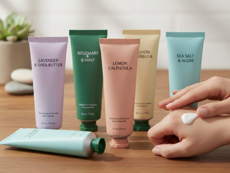
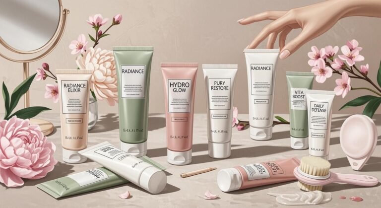
What Tube Colors Communicate
When you pick a skincare tube, you show your brand’s style. The color you choose sends a message before anyone reads the label. Different colors say different things about your product and change how people feel when they use it.
White in Skincare Packaging Tube
White is easy to spot on skincare tubes. It is everywhere because it looks clean and fresh. If you want your brand to look pure and simple, white is a good choice. Many brands use white to help people trust their products and feel safe.
Here’s what experts say about white packaging:
| Source | Key Points |
|---|---|
| The Packaging Company | White shows purity, freshness, and simplicity. It works for strong brands. |
| Merchant Boxes | White means purity, simplicity, and cleanliness. |
| JohnsByrne | White is like a blank canvas. It shows innocence, equality, and new beginnings. It also means cleanliness, purity, efficiency, or simplicity. |
Using white on your skincare tube helps customers feel sure about your product. White makes people think the product works well and is safe. It is also a good choice for sensitive skin products.
- White is linked to purity and cleanliness. This makes people think the product works well and is high quality.
- White packaging can make people feel the product is safe and simple.
- Colors on packaging show what the brand stands for and make people feel certain ways.
Blue in Skincare Packaging Tube
Blue is a popular color for skincare tubes. You see blue on products that want to show calmness and trust. Blue makes people feel relaxed and safe. It is also used by brands that care about the planet and ocean life.
| Evidence Type | Description |
|---|---|
| Color Association | Blue is linked to calmness and relaxation. It helps people trust the product and think it works well. |
| Consumer Preference | Many people like blue packaging. Blue is common in test kits and makes people trust the product more. |
| Credibility Perception | Colorful packages seem more believable. Blue is the most used color in medicine packaging. It helps people feel familiar and safe. |
You can use blue to show your brand cares about the environment. Blue also helps your skincare tube look trustworthy and effective.
- Blue packaging often means the brand cares about the planet.
- Brands with blue tubes talk about protecting nature.
- Some brands use blue to support saving sea animals.
Green in Skincare Packaging Tube
Green means nature and caring for the earth. If you want your brand to look natural, green is the best choice. Green tubes tell people your products are safe and good for the planet.
| Benefit | Description |
|---|---|
| Resource Conservation | Biodegradable tubes use materials like bamboo and sugarcane. These can grow back. |
| Energy Efficiency | Tubes made from plants need less energy to make than plastic tubes. |
| Positive Brand Image | Eco-friendly packaging makes your brand look good and shows you care about the earth. |
| Environmental Impact Reduction | These tubes break down easily, so they don’t fill up landfills or pollute the ocean. |
| Safety for Products | Plant tubes do not let out bad chemicals. This keeps products safe. |
| Evidence Description | Key Insight |
|---|---|
| Packaging parts like color and material change how people feel about products. | These things help people decide what to buy and if the product is good for the earth. |
| Most people pick products because of color. Green is a favorite. | Green makes people think of caring for the planet. |
| Good design helps people see what makes a product special. | Design can make a product look more eco-friendly. |
| Companies use words, pictures, and feel in packaging. | These things help show the product is good for the earth. |
If you want your skincare tube to look eco-friendly, green is the best color. It helps your brand look caring and responsible.
Pink in Skincare Packaging Tube
Pink adds warmth and fun to skincare tubes. You see pink on products that feel gentle and soothing. Pink is linked to femininity and self-care, so it works well for brands that want to feel friendly.
- Pink is linked to femininity and treating yourself.
- Soft pink is liked by people who want calm beauty routines.
- Bright pink is for younger people.
Pink packaging makes people think of kindness and good feelings. It helps your brand feel friendly and welcoming. Many brands use pink to show youth and energy, which makes their products exciting.
- Pink packaging is linked to femininity, kindness, and good feelings. It helps brands look warm and friendly.
- Pink feels soothing and helps people relax and take care of themselves. This is important in beauty and skincare.
- Pink is linked to youth and energy. Many brands want to show these things to make their products exciting.
Black in Skincare Packaging Tube
Black means luxury and style in skincare tubes. If you want your brand to look special, black is a strong choice. Black tubes look fancy and powerful. Many luxury brands use black to show their products are valuable.
- Many products are made to be gentle and not cause irritation.
- They use plant extracts and oils.
- Products do not use animal parts.
- Labels may say cruelty-free or tested by skin doctors.
- They often talk about keeping skin hydrated and not greasy.
Black packaging makes people feel certain ways and helps build brand identity. Black and gold together look fancy and special. Expensive skincare brands use these colors to show high quality.
- Black works with many other colors.
- It means style and elegance.
- Fancy brands use black to show their products are valuable.
- Black packaging is linked to luxury and style.
- It shows elegance, power, and being special.
- Top brands like Chanel use black to show timeless style.
Gold and Silver in Color Packaging
Gold and silver make skincare tubes look expensive. These colors show luxury and being special. If you want your brand to feel fancy, gold and silver are great choices.
- Fancy packaging with gold and silver makes people think the product is worth more.
- Good materials and nice designs make products feel special.
- People think luxury packaging means better products and are willing to pay more.
Gold and silver tubes help your brand stand out in stores. They make customers feel special and want to pay more for your products.
Other Colors in Skincare Packaging
You can use other colors to make your skincare tubes unique. Bright colors like electric pink and blue bring energy and attract younger people. Soft colors like lavender and mint green feel calm and stylish, which older people like.
- Bright colors like electric pink and blue mean energy and attract young people.
- Soft colors like lavender and mint green mean calm and style, which older people like.
- The color you pick changes how people feel and think about your brand.
If you want your brand to stand out, try colors that are not used much. Unique colors can make people curious and help your product look different.
- Unusual colors can make people feel different things.
- Unique colors stand out on shelves and get attention.
- This attention can make people want to try new products.
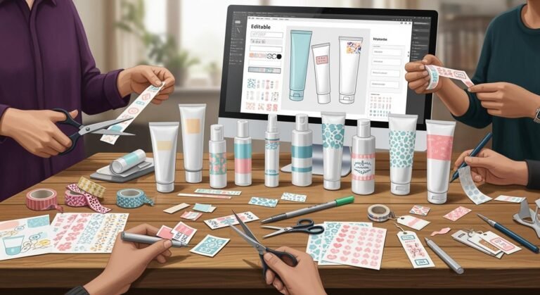
Tip: When you pick colors for your skincare tubes, think about your brand’s values and the feeling you want to give. Custom packaging lets you match your design to your brand and audience. The right color can help people remember your brand and make your products feel special.
Choosing Skincare Packaging Tube Color

Aligning with Brand Values
You want your skincare packaging to tell your story. Start by thinking about your brand’s mission and what makes you different. Ask yourself: Who are your customers? What do they care about? When you know your audience, you can pick a color that matches their emotions and your brand’s identity. For example, if your brand stands for purity and simplicity, soft pastels or white work well. If you focus on luxury, black or gold can show that.
- Define your core identity, like your mission and vision.
- Understand your target audience’s age, style, and what they value.
- Pick a color palette that fits your market and sparks the right feelings.
You can use the same color palette across all your skincare packaging. This helps people recognize your products. Try to keep your design and texture the same for each product type. This creates a signature look and feel for your brand. If you want the best skincare packaging, work with designers who know about color psychology and sensory design. They can help you create packaging that stands out and connects with people.
Considering Market Trends
Trends in skincare packaging change fast. You need to know what’s popular in your market. In Europe, people like minimalist packaging with soft colors like white or pale pastels. In Asia and the Middle East, bold and bright packaging is more common. Sometimes, seasons or holidays affect color choices. For example, red and gold are popular during Diwali in India, while cherry blossom pink is big in Japan during spring.
- Many people now like soft, muted colors and earthy tones. These colors make products feel pure and calm.
- Brands use color trends to connect with customers and stand out from other cosmetics on the shelf.
Look at what your competitors do. Some brands use color-changing serums or color-coded collections to make shopping easier and more fun. This kind of customization can improve the user experience and help your brand stay ahead.
Testing and Feedback
Don’t guess which color works best—test it! Show your skincare packaging to real people and ask what they think. Try different colors and see which ones get the best reactions. You can also check what your competitors use and learn from their successes or mistakes.
- Avoid using colors that don’t match your brand message. For example, neon colors may not fit luxury skincare packaging.
- Soft pastels work well for skincare, while bold colors fit makeup. Use black or gold for luxury items.
- Dark or dull colors can make new products less appealing.
Testing helps you find the best skincare packaging for your brand. Listen to feedback and keep improving your design. This way, your packaging color will always match your brand and attract the right customers.
Tip: The right color packaging can boost your brand’s identity and make your products unforgettable. Stay open to feedback and keep your design fresh for the best results in skincare.
When you pick a color for your skincare packaging, you tell your brand’s story. Studies say color helps people remember brands. About 80% of brand recognition comes from color. Blue and green colors help people trust your brand. These colors also make people feel good.
| Aspect | Impact |
|---|---|
| Brand Recognition | 80% linked to color |
| Emotional Connection | Green and blue foster trust and well-being |
Here are some steps to help you choose the best packaging:
- Learn how color psychology works with your product.
- Ask customers what they think by using surveys or focus groups.
- Work with design experts to make your packaging look special.
Picking colors that fit your brand’s values helps people remember your products. It also helps you connect with your customers.
Tube Color & Branding – Frequently Asked Questions
How color choices on cosmetic tubes shape perception, shelf blocking, compliance, sustainability and conversion—plus tips for Pantone control, finishes and regional nuances.
1) How does tube color influence brand perception?
2) Do finishes change how colors read?
3) What Pantone/LAB controls keep my color consistent?
4) How do substrates affect the final color?
5) Are there cultural meanings I should consider?
6) How does color help with on-shelf blocking?
7) What color+finish combos photograph best for e-commerce?
8) How do I maintain accessibility and legibility?
9) Does sustainable design limit color choices?
10) Will heavy foils or metallic inks change perceived color?
11) What colors signal specific skincare benefits?
12) How should I color-code a range without confusing shoppers?
13) Any tips for small tubes (10–30 ml) with limited space?
14) Common mistakes to avoid?
15) Why work with Xinfly Packaging on color?
Ready to customize your packaging? Contact our team for detailed pricing, MOQ flexibility, and fast production samples.